Lola

E-Commerce App

Lola

BEAUTY & CARE

your
portrait

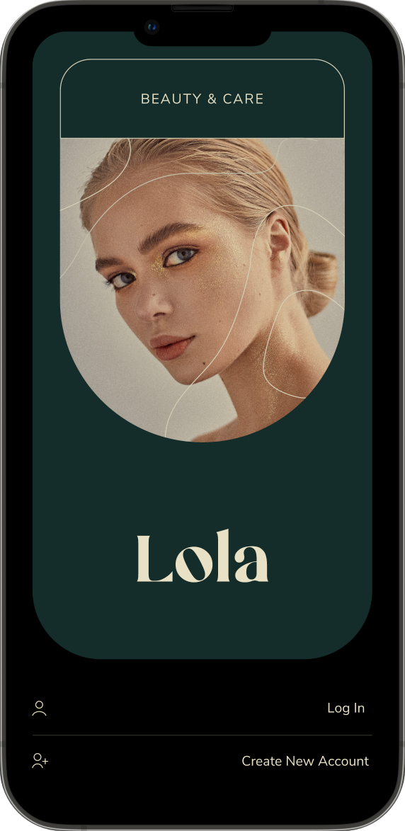
Lola is an e-commerce app that offers beauty, wellness and fashion products.

Following is a case study that displays my Visual Design process for an MVP
CLIENT
Lola
ROLE
Branding & UI
PROJECT TIME LINE
3 weeks
TEAM
Sole Designer
Visual Design of Log In Sign Up page
Mock up of Menu
Mock up of catalogue
Mock up of product customization
Mock up of cart
mock up of checkout

TYPOGRAPHY

mock up of typography

TYPEFACE

Dissection of how typefaces are used

Nicky Mikela

is a Bold Minimalist Elegant Modern vintage font. It was used to establish the foundation for a luxurious yet brand. The versatility of this typeface allows it to be applied across everything from banners to mobiles. This makes it a pragmatic choice for the primary font from a vintage branding yet modern and digital perspective.

Nunito Sans

is a regular non-rounded multi weight display font from the family Nunito. It affords legibility when used in body and small sizes. This minimal typeface was paired with Nicky Mikela to balance out the vintage feel of the primary font. This secondary font brings in a touch of modern type to the branding while taking the backseat and allowing Mikela to set the grander tone.

TYPESCALE

Type scale

Composition

Grid

six column grid mockup

The standard 6 column grid that allows to divide the screen into: 
half and thirds.

Spatial System

8 pt spatial system mockup
A linear scale with baseline of 8pt for elements.
4pt half step for spacing icons, small text blocks.

Rationale

Uniformity on a spatial level allows the product to be more consistent across various digital landscapes. With increasing size and density of new screens a rigid baseline helps scale designs with ease.

Layout

layout mockup that displays margin, padding and no content zone

COLORS

Color Scheme

Timber Green

Almond White

Midnight Black

Lotion White

Hue

Visual Design of Log In Sign Up page

Primary

#142D2A

The color green signifies nature. In the human psyche green evokes a feeling of wellness. Specifically the darker tones in timber green are significant of a abundance (dense forest). This specific tone is used to convey abundance, peace and a sense of security. 

Shades

Secondary

#E9E1C5

Almond White a subtler interpretation of of the color gold was used to signify luxury. In addition to contrasting with the primary color it also adds a neutral, elegant and luxurious sense to the brand.

Shades

Mock up of catalogue

Tertiary

#000000

Midnight black is symbolic of power, elegance, and sophistication. This serves the purpose of creating elegance in the brand. it pairs perfectly by taking a backseat when used in the background with the primary color. It also servers in contrasting well with the secondary color.

Shades

Lotion White

#FFFFFF

Was used in the backgrounds to create a visual texture while aiming for a minimalism for the user experience. Lotion White allows product images and other colors to pop.

Shades

Accessibility

accessibility chart

Icons

👍

Thanks for viewing!

Other Case Studies

icon of an up arrow
BACK TO TOP
Made in Webflow