MOBILE APP
Codebyte approached me with the requirement to make an Emergency Assistance app for its users. Following is a case study on the entire process of this product's design
PROJECT TIME LINE
10 weeks
PROBLEM
Accidents happen irrespective of age or environment. On an average older adults require more assistance than their younger counterparts as they are more prone to suffering through physical or cognitive disabilities. On the flipside anyone can find themselves in a compromising situation at or away from home with no help around.
DESK RESEARCH
Major assistance is required for the following categories :
Are the #1 cause of death amongst elderly people. 50% of those who fall require assistance from someone else to get up.
Is one of the major causes of disability and dependency among older people.152 million people are projected to be affected by 2050 worldwide.
❤️🩹
03. Heart diseases and strokes
Strokes, Cardiac arrests and heart attacks can turn fatal if treatment is not administered within a few minutes. It is vital to pick up cues from wearable technology as early as possible.
More than 15% of 911 calls were for a "sick person” making it the most common type of call. Ranking next on the list were “breathing difficulty”, “fall/injured”, “vehicle accidents” and “chest pains”.
GOALS
01
Recognize & facilitate assistance during
all emergency situations
02
All medical records & history must be instantly
available during an emergency.
03
If no help available, empower the user to
be able to help themselves.
METHODS
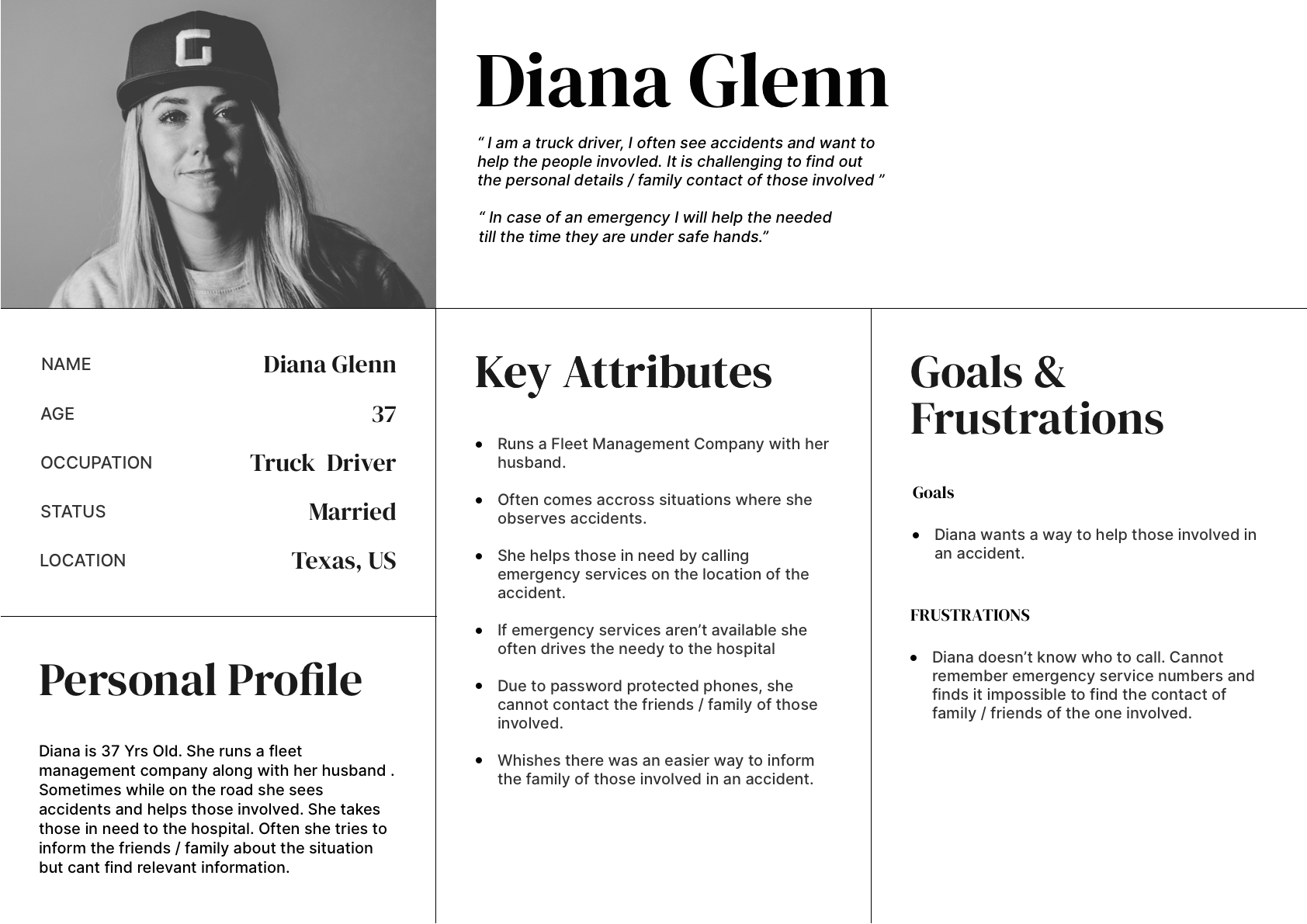
01. USER PERSONAS
02. STORYBOARDS
05. USER SCENARIO &
VISUAL DESIGN
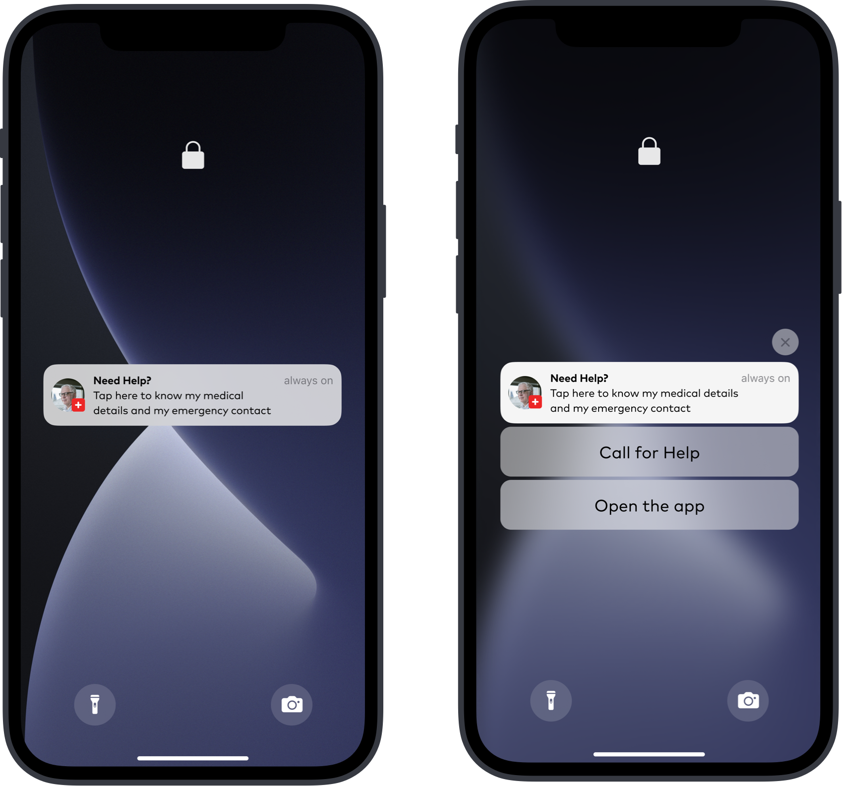
01
Lock Screen
Richard meets with an accident. Someone rushes to his aid and grabs his phone.
He checks out the lock screen and taps on the notification.
02
Home Screen
He slides the emergency button to call SOS.
App initiates SOS and calls all emergency contacts.
03
Emergency Call Screens
Richard’s emergency contacts / local authorities are on the call where they try to assess his medical condition.
04
Medical Data Screens
Richard is taken to the hospital to be treated. The doctors access his medical data to understand his condition better.
SECOND SCENARIO
01
HOME SCREEN
Richard meets with an accident while on a trip outside his home town / country. He first alerts his emergency contacts
03
Safety Toolkit Screens
Richard then opens the safety toolkit and checks his options for - Nearest Hospital or Request Ambulance.
03
PROFILE PAGE
Richard checks his vital health status which are pulling data from his wearables. He then chooses his most suitable option to safety.
VISUAL BREAKDOWN
Composition
Grid
The standard 6 column grid that allows to divide the screen into:
half and thirds.
Spatial System
A linear scale with baseline of 8pt for elements.
Additional 4pt half step for spacing icons, small text blocks.
Rationale
Uniformity on a spatial level allows the product to be more consistent across various digital landscapes. With increasing size and density of new screens a rigid baseline helps scale designs with ease.
Typography
Typeface
Mark
Pro
Rationale
Legibility & speed are of paramount importance while interacting with a device while mitigating crises. Legibility being in the primacy as the user could be temporarily visually impaired.
Mark Pro turned out to be a good solution as it is strong, simple and bold at a glance. The letter shapes are wider, letter proportions are balanced, and the x-height is uncharacteristically higher, which ensures a high degree of legibility. This means that it can be used across a wide range of applications as the middle weights are optimised for body copy and larger ones for headings.
COLORS
Color Scheme
Rationale
The color red incites the human Psyche. Across cultures / industries it is conventional wisdom that Red means danger. Red is also the most used color within the health industry.
Color blue on the contrary calls to mind feelings of calmness or serenity.
The intent here was to add a sense of stability and reliability within the color red. To have a color that primarily alerts the user but assures safety along with it. Such was the rationale behind the color crimson
Contrast Polarity
The major user segment of this app are those with some form of disability or older adults (who might have cloudy ocular media such as cataract).
Considering the fact that accidents can occur both indoor and outdoor, the ambient light outside is subjective depending on the time. Dark mode is difficult to use outdoor both during daytime and night time.
Multiple studies suggest that on average Light mode performed better -
1. With users of all age (Benefits older adults more).
2. Performs better with or without ambient light.
3. In Visual-acuity tasks and for proofreading tasks.
The only pro of dark mode is that it helps visually impaired users, but this was a tradeoff to be made.
FINDINGS
SUMMARY
✅ All users were successful in completing the following tasks-
01
👍
You found someone unconscious,
reach out to their phone to help them.
02
👍
You are a doctor,
access the
patient's phone and retrieve any medical data
03
👍
You are lost with no help around
find your way home using the phone.
SPECIFIC FINDINGS

🟢 Intuitive
4 out of 4 users found the app to be easy to use : They rating it 5 out of 5 (5 being the easiest to use)
🟡 I.A - Space for improvement
1 out of 4 user had difficulty finding the Medical Data screen.

🔴 CTA for SOS - UNCLEAR
2 out of 4 users did not understand that they had to slide the call slider to initiate SOS.
( This test was conducted on initial versions of VD, Designs were updated accordingly )
06. TESTIMONIALS
“It's great that I can call for help this easily and notify my family”
“ Oh, This will be super helpful to store my medical data"
“I will definitely use this when I am travelling overseas for my safety”
“I am happy that I won't need to carry around local ambulance / police contact details while travelling”
07. RETROSPECT
So what can be improved in the future?
🎙
Introducing a “Voice Assistant” feature can significantly improve the interaction for the disabled/injured.
🍃
Improving the aesthetics and adding Micro-animations for better experience.
📞
Adding a “Call Me back in X minutes” feature can provide support for those who are knowingly taking risks.
⌚️
Designing for Wearable technology.
💸
Making the app more pragmatic by adding a revenue model.
🗣
Seeking budget for field study with doctors and patients to gain deeper insights and conduct better UT.

BACK TO TOP


